


Kraft Natur
—
Client
"Kraft Natur"
Services
Brand identity
Package design
Task
Kraft Natur (ger. for "Power of Nature") is a young project from Cologne,Germany and a team that appreciates natural resources and high quality. I had to develop packaging design and graphics capable of distinguish the brand from competitors and attract a really narrow audience of like-minded people, taking into account the possible expansion of the product portfolio.
The product
Kraft Natur uses fruits grown in the fields without the use of pesticides, insecticides and chemical fertilizers. Directly squeezed juice with pulp retains all the benefits and vitamins. Clean ingredients and recyclable packaging are key to the brand, so I tried to keep the project simple, clean and beautiful.

Design Ideas
Just juice and nothing else. Therefore, the design decision must be humane, clean and ecological, while remaining attractive.

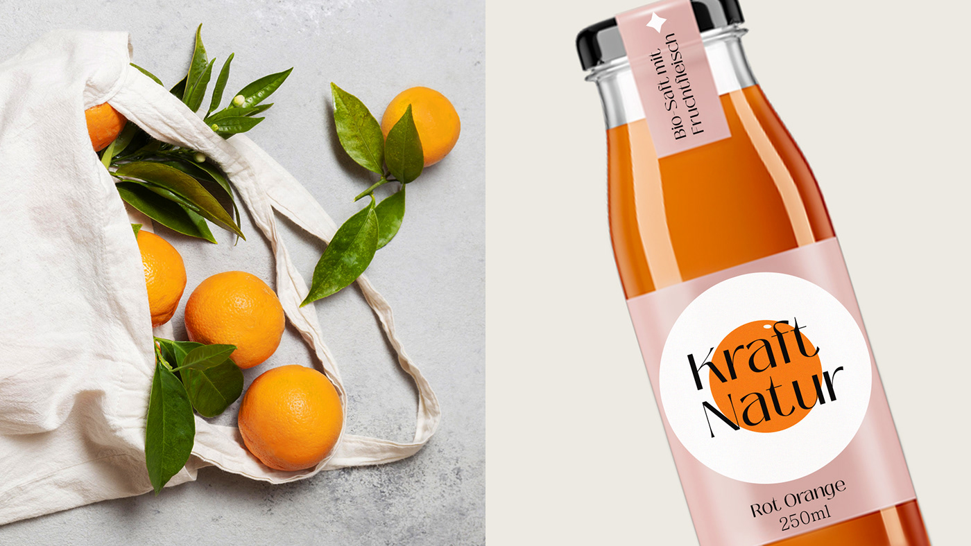
Design
A simple logo and simple, almost geometric fruits behind it draw attention. And bright colors will emphasize all the ripeness and naturalness of fruits. The soft powdery background shade softens the rough shapes of fruits and brings them closer to nature.


An accent font with different line weights and a slight hint of serifs looks very handmade for such a craft project,
which only emphasizes its individuality.


It was important for me to focus on fruits - beautiful, associated with warmth and sun, but at the same time make them as simple
and clean as possible. Therefore, a pattern appeared that supports the style of the brand and actively participates as additional graphics for merchandise and advertising.


Kraft Natur — Just juice and nothing else!


